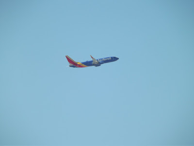
So next month we come up to 1 year when I went to Non-European country in the United States of America as you know I had an amazing trip from non-aviation photography. So today I will compare Southwest Airlines liveries. Because I never went to the US before I never saw this green Southwest Airlines and special liveries like SeaWorld I won't mention any of those liveries this is only my photos I took in Las Vegas while I was on a tour in the city. So lets take a look then.
This photo is the previous & still current Southwest Airlines livery featuring dark blue fuselage even green as well. There is not much to say about it other than that the Southwest Airlines logo is located at the tail red & orange stripes and this curly thing orange & hole red colour at the bottom of the aircraft. The winglets has the same look as the tail as with Southwest Airlines logo bur because I never seen Southwest Airlines before, I give it some credit it's not bad look.
Now we come to the new & current livery and WOW what huge improvements! First off the livery is a bit more darker blue or purple look with Southwest Airlines logo located on the fuselage and engines. The tail looks nice with yellow and red same on winglets however the love heart is missing. Now I mention about the love heart, it's South West Airlines new logo but somehow did Southwest Airlines forgot to put the heart on the aircraft? or located in the cabin. So we come to the end of Southwest Airlines livery to compare I'm going to vote for the new livery because it was my first time spotted it when I landed in the US then the old livery second. Next time I go to the United States I might explain more into Southwest Airlines i.e. history.


No comments:
Post a Comment